Saturday, 13 February 2016

Prop Sourcing

Starchild Tarot Deck
            “The Starchild Tarot is a unique, cosmic deck that touches on various themes and styles connected with magic, spiritualism, and the wonders of the Universe. Through these colourful gateways, the reader may awaken to new ways of perceiving the Tarot and the nature of Consciousness.”

After browsing on Instagram one evening I came across the Starchild tarot deck, and I immediately fell in love.  The colour scheme is what initially drew me in, I adore the balancing pantones brought out earlier in the year, and I feel the pink and blue are very close to Serenity and Rose quartz,


I plan to use the cards as props in the still life shoots, either creating piles or laying them flat as a background for macro photography.

Angel Aura

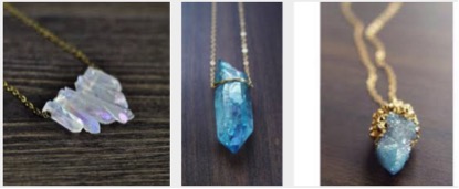
Angel Aura’s are a type of enhanced quartz; I’ve noticed this is a really popular stone among Instagram jewellery trends.  Bonded with silver, gold or platinum, the stones are considered luxury in the category of semi-precious jewels. The iridescence has gained popularity and the rainbows captured are admired. 


I have purchased three stones of varying sizes to add colour and interest in my images. Below is a Tanzine blue aura quartz. I think the colour is exquisite and think it is a nice piece to have in still life. This piece was £21.00 and is being shipped from America, but should not take too long to arrive.

I also purchased two pieces of clear angel aura quartz; this stone is the most popular among the treated stones so thought it would appeal and help create the proposed aesthetic.

I already have the majority of the stones and crystal props I think I will need, however I will keep an eye out in case there are additions to be made.

Thursday, 11 February 2016

Still life inspiration


clean | simple |  calm


These are images from Tamunu Oil Lab, an online brand that promotes their products via their Instagram page. I think the simplicity is so effective in creating a beautifully calm image. I like the cool grey tones in the images of oil bottles in contrast with a warmer, natural light image of the flower. This is something I'd like to recreate with different lighting set ups, camera settings and post production to create the balancing effect. 

It is interesting that cool and warm tones contrasting are emerging as a trend that I am hoping to achieve through my photography. I attended a Wella hair show around five years ago when I was studying a year of hairdressing. I didn't realise at the time but it was trend forecasting for 5 years into the future. One of the trends was named Celeste, a futuristic macro trend that combines cool and warm tones together in hair colour techniques. Five years on and I am looking at this trend, I just find it so fascinating. 


The warmer tone in the flower image really freshens it up in comparison to the others, I think fragrance images would benefit from a warm tint to enhance the mood.  


I found these images scrolling through Instagram, i follow a lot of organic beauty stores online from the UK, US and Australia. The simplicity and perfect placement is what I want to achieve when shooting my images. i have ordered some dried lavender seeds as I like the pile of Himalayan salt in the second image in. 
 Colour is something I will enjoy experimenting with, the colour pallet is something i have thought about a lot, looking at pantones is something I plan to do when designing. 

Tuesday, 2 February 2016

FMP proposal feedback...

Proposal Grade & Feedback

I received my grade and feedback for the proposal, I felt I worked really hard on the assignment and put a lot of time into both the research and writing of the paper.

I received a B1 for my efforts and I was at first a little upset I hadn’t got a slightly higher grade, but over all after speaking with Emma I’m really pleased with the grade and the feedback.

The feedback is both positive and helpful, I’m pleased that my concept was explain well on paper as I struggle to tell my peers or tutors what my project is about in short.

Thinking about harmful ingredients and brands the comments about being delicate in this area are helpful, I wasn’t planning on naming and shaming individual brands but rather being transparent about what ingredients regular beauty products contain and their effects on health/wellbeing. After a chat with Emma I have decided a list of harmful ingredients would be more helpful than focusing on products.

It would have been helpful to have more website layouts- I did create a mock site on Wix, however it did not reflect what I envisioned so did not include it in my proposal; on reflection I should have included the link for a general idea.